Since my last DOH update — an email about the introduction of “Zones” and their implications for NYC schools like the Agile Learning Center — I’d been watching the news for updates on transparency about what criteria move an area into or out of a zone designation. I’d also been keeping an eye on general city stats, ongoing transmission research, testing updates, biases in coverage, and general news of note. Our number of positive cases per 100,000 of the population for the city as a whole has been more than 5 (considered a stable rate) but less than 10 (the rate where travel restrictions kick in), and steadily increasing. The transmission news this week is that the virus has been shown to be able to live for unnervingly long on nonporous surfaces [in an experiment that tested an unrealistically dark and still environment compared to what most of our cell phones experience in a day…but still. Wash your hands and wipe your phone often.] Waiting for an email back from Abbott about the test they’ve been developing that I’m hoping would be cheap and fast enough for regular community use. Wondering at voting and election congregating will do to our pandemic landscape, and what holidays will do after that.
Last night, after reading Teachers’ Union Twitter discussing how the “mandatory 20% of staff and students” weekly testing for yellow-zone-school folks was impossible when they didn’t have testing consent forms from the vast majority of families, I finally got answers to my zone threshold questions. The DOH emailed a fantastically thorough 9 page document, explaining the reasoning behind their new “micro-cluster” approach and including these 2 charts:
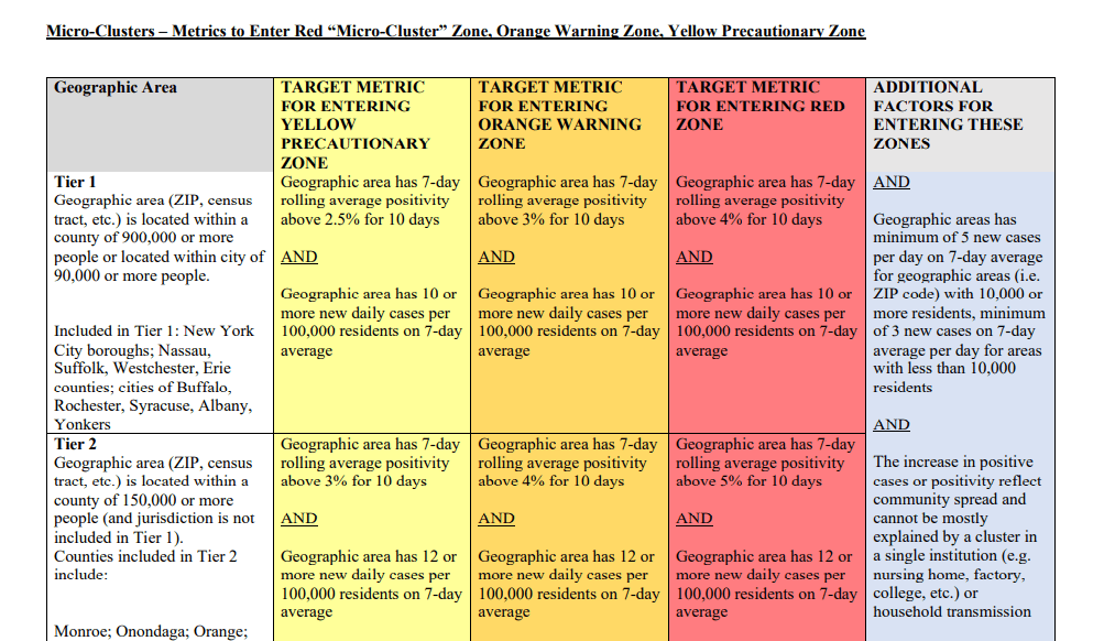
the amount of testing being done and a general increase in reported cases, using rolling 7 day averages.
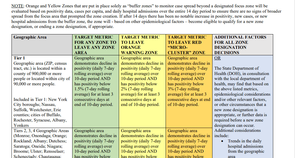
sufficient testing being done and a general decline in local positive test results, using rolling 7 day averages.
Looking at both rates of testing and at positivity rates, along with considering daily 7-day rolling averages, somewhat accounts for variation tied to people getting tested multiple times (like folks who have to get tested weekly for work or school), accessibility or inaccessibility of testing for a population, and delays in data reporting. The metrics being used are tied to data that I can look up for boroughs, which isn’t hyper-local enough to know predict exactly which community-members live in areas that are about to become (or stop being) designated zones, but it’s more than I had to work with before. And that is the flip-side of this “micro-cluster” approach: on one hand, it means a spike in a small area that’s large enough to skew positivity rates for the whole city will be targeted and contained instead of shutting everything down. Where the spikes are in neighborhoods folks don’t tend to commute into or out of — and impacting schools, for example, where all families involved live locally — this approach of treating hotspots instead of whole neighborhoods or boroughs could be really effective.
It’s trickier when the reality is that most of our households have members who commute to other parts of the city to work, learn, and shop. It’s even trickier for a school where our households are scattered through and around the city. We’re networked…so the same as I can be carefully managing my exposure but my roommate’s exposure is also mine (and those of the people we both work with in person, and those of everyone in those people’s households, and so on and so forth), East Harlem can be contentedly not in a “zone” while a hotspot neighborhood faces restrictions, but as long as people, vehicles, and goods are moving between us, their increased risk is also ours. And we know that without folks being resourced to stay put somewhere comfortably traffic across the city is going to keep flowing…staying still is just not part of how we as a city do things! So. I’m not saying this makes the hyper-local covid management approach useless — I’m actually a fan based on what I’ve read — but it does mean both that we have to be careful that not being in a zone doesn’t lull us into a false sense of safety, and it means that a revision of the school plan that keeps us all safe will need more nuance than just the “everyone operate based on the zone of the school address” approach of these newest guidelines.
*** A thing to watch: The additional factors to move out of a zone include things like increased “enforcement” and the ruling party’s impression of how “cooperative” community leaders are. Ideally this just means grocery stores don’t let people in without masks, and folks discourage the kind of behavior that leads to super-spreader events. It could reasonably mean consequences for reckless endangerment, including deplatforming religious leaders spreading lies about the virus being a hoax (clearly the incident that inspired this provision in the plan). But it may also mean increased police presence, at a time when the NYPD’s resistance to responsible PPE use makes them likely virus vectors. It may mean that if local business, religious, and other community leaders demanding aid or protesting demands to increase surveillance of those they’re responsible to — while otherwise following best practice covid protocols — are inconvenient enough to the wrong people in charge, they may face longer periods of restrictions as part of a power play. I’d love to not feel a need to flag this, but I studied how the power of social control is a difficult thing to convince elites to not abuse and to relinquish once it’s been normalized. With the police union and academic journals endorsing presidential candidates after a summer that saw the city’s first curfew since 1943, though, use of these vague and subjective “additional factors” is…going to be something to watch.

Leave a comment